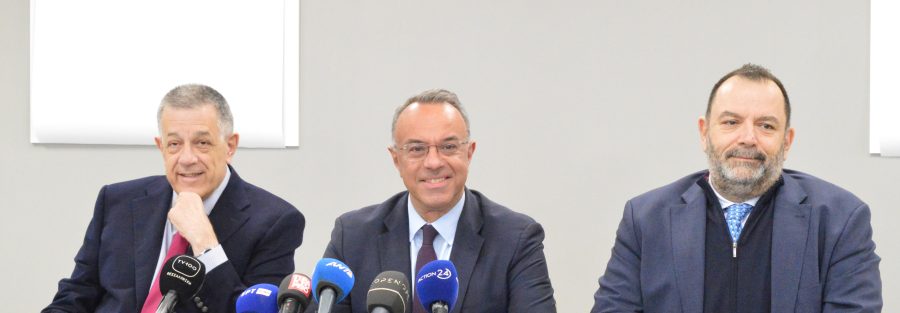
The visual identity (logo) of Thesssaloniki Metro was presented today, Wednesday November 13th 2024, by the political leadership of the Ministry of Infrastructures and Transportation in the presence of the CEO of ELLINIKO METRO S.A. Mr. Nikolaos Kouretas presented during a press conference held at the Depot of the Thessaloniki Metro in Pylea.
“The Metro logo is a reflection of both the historical depth of the city of Thessaloniki and the innovative nature of the Project” stated the Minister of Infrastructures and Transportation Christos Staikouras, pointing out that “in 17 days the Thessaloniki Metro Project will be delivered to the citizens of Thessaloniki and will breathe new life into the city’s daily rhythm”.
In terms of the design of the visual identity, the Minister of Infrastructures and Transportation pointed out that the challenge was to create an identity capable of endowing this state-of-the-art project with the historical importance of the city of Thessaloniki, a major hub in Byzantine Empire.
“The small letter “μ” was an obvious choice, since it directly refers to the Metro and is – at the same time – different than the capital “M”, which is widely used with several variants worldwide. Thus, the byzantine small letter “μ” was simplified to combine authenticity and innovation, the two characteristics we wish the new identity of the Thessaloniki Metro to convey” mentioned Mr. Staikouras.
As explained by the Minister of Infrastructures and Transportation, this way we managed to create a clear and recognizable logo, a must in a modern transportation system, ensuring thus legibility and easy use at all times.
The Deputy Minister of Infrastructures and Transportation, responsible for Infrastructures, Nikolaos Tachiaos, stated:
“The Thessaloniki Metro is not only going to change our daily lives; it will reshape the entire city. Its identity is not only the identity of an infrastructure project but also the identity of the entire city of Thessaloniki. It is worth considering that the metro systems themselves worldwide reflect the image of their cities. A characteristic example is the font used in New York City Metro, which has become one with the aesthetics of the city itself and has been widely adopted, even in our computers.
“The logo combines the past with modern aesthetics. This is the reason why the small letter “μ”, which can be also read as a capital “M” was selected” said the Head of the Architectural Section of ELLINIKO METRO S.A. Ms. Chyssoula Kousteni, who also pointed that the “color palette used is blue black, a color symbolizing stability and inspiring trust”.
Mr. Carlo Bianco, CEO of THEMA, the Company responsible for the Operation and Maintenance of Thessaloniki Metro, participated in the press conference and made a detailed presentation of the safety and operation-related aspects of the Thessaloniki Metro stressing that there is zero possibility for failure of the operational systems of Thessaloniki Metro. “We focus on world-class operating standards on safety. Everything has been designed to the maximum safety” pointed out Mr. Bianco, adding that “nowadays, there are 2,000 km of fully automated metro networks. In 40 years of operation of the automated metros worldwide, there have never been any problems”.


